


Description:
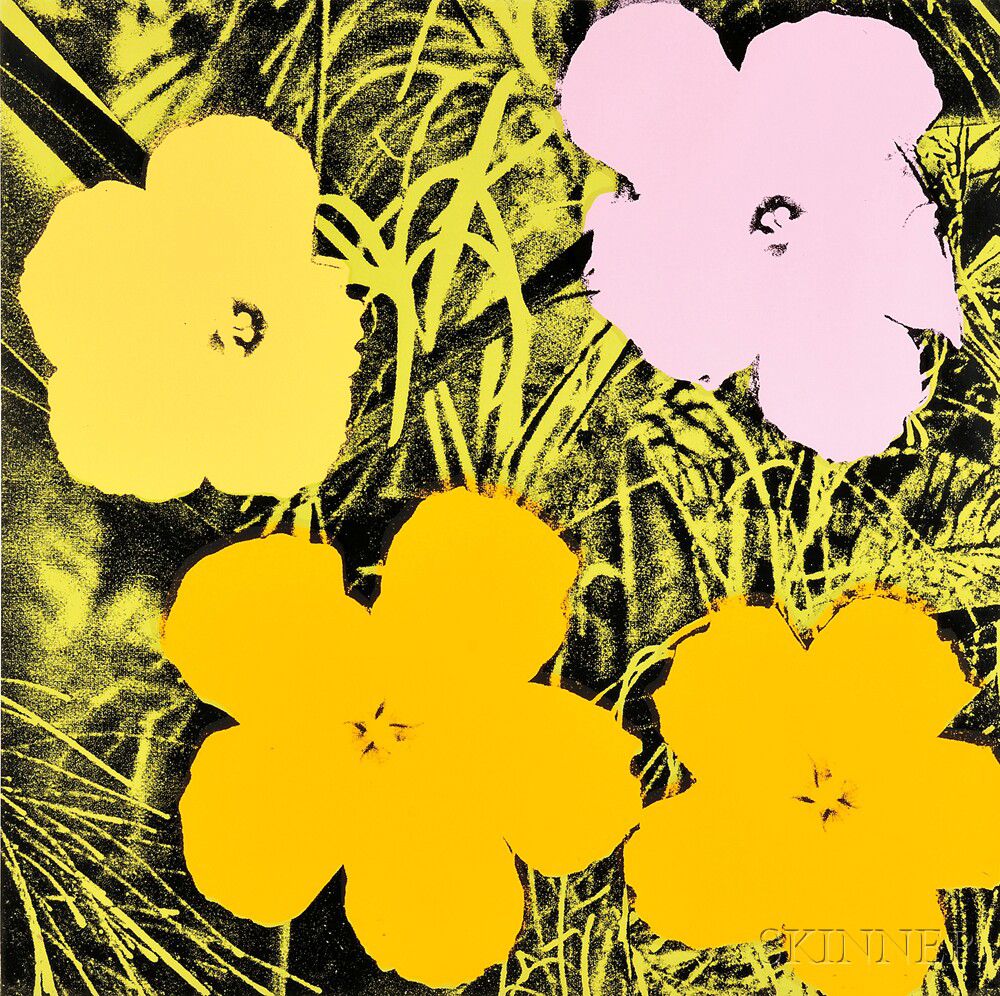
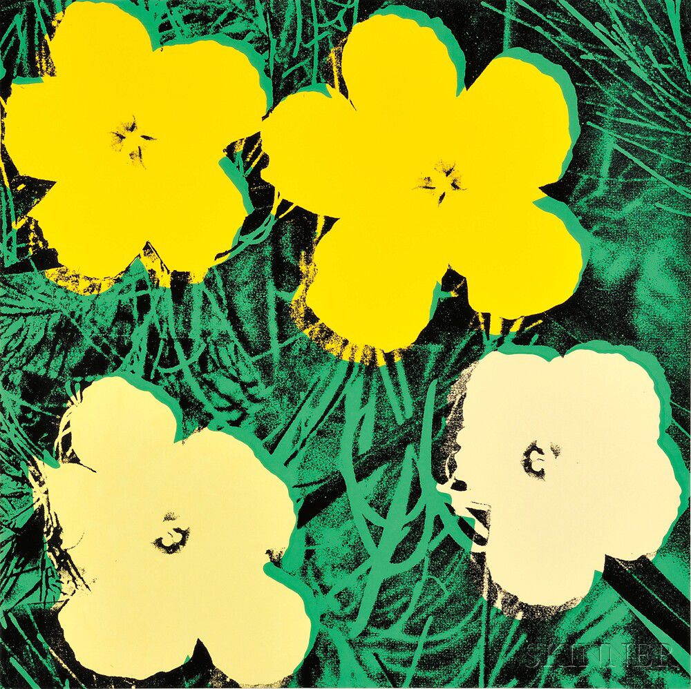
Andy Warhol (American, 1928-1987)
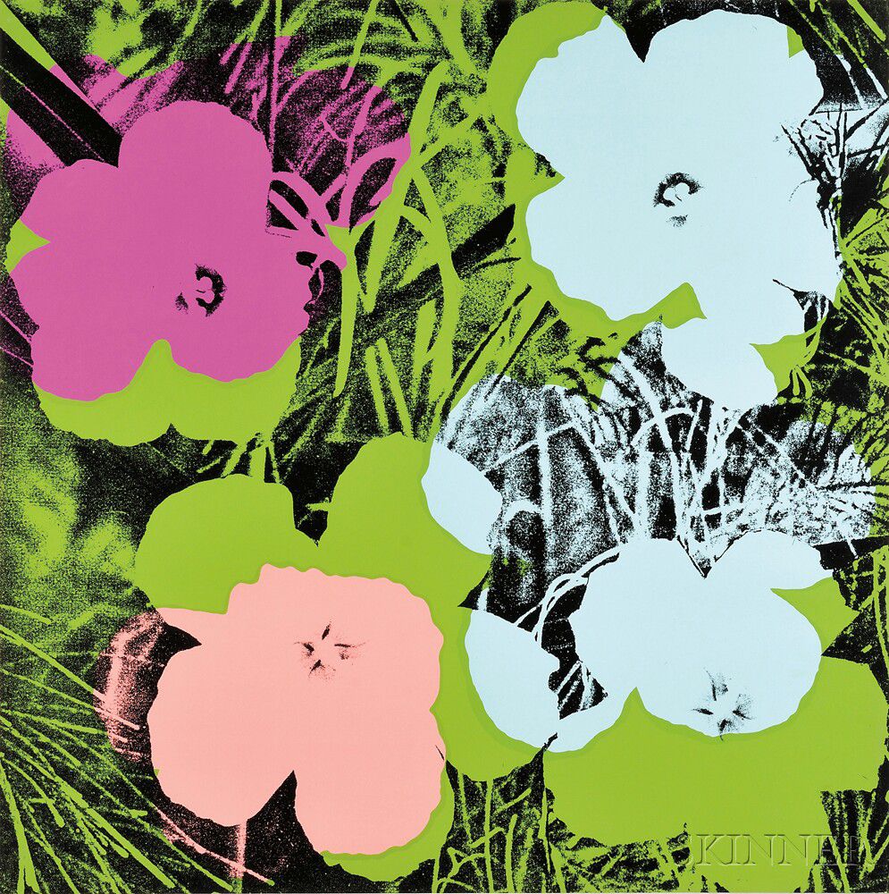
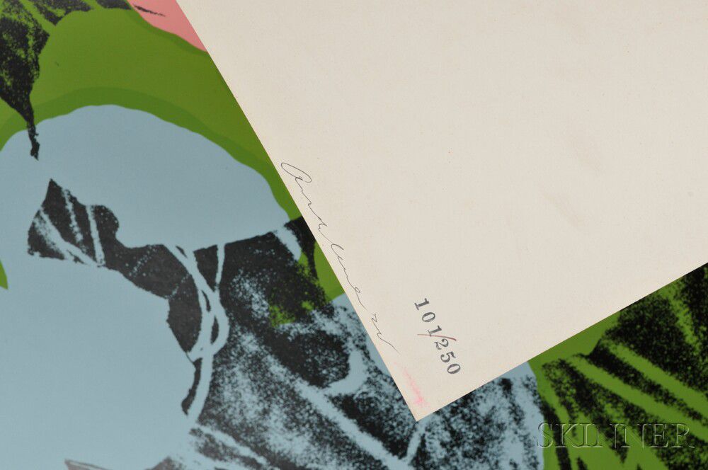
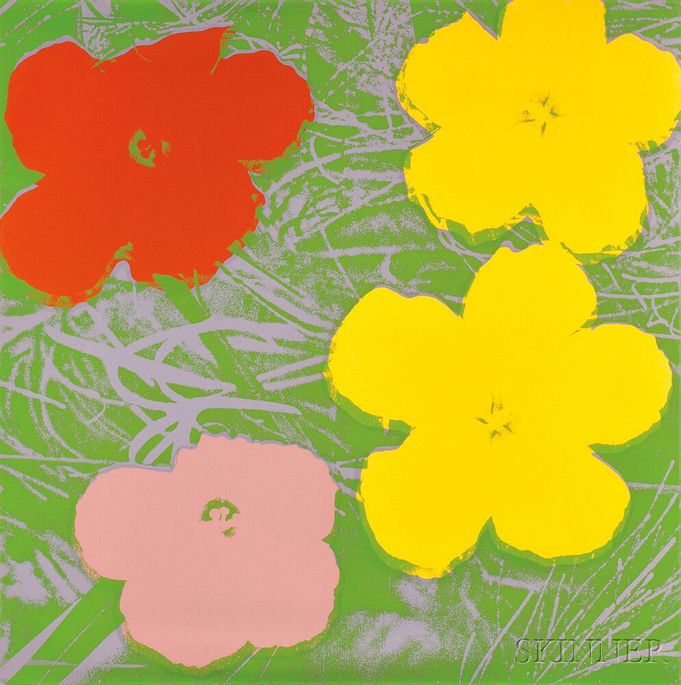
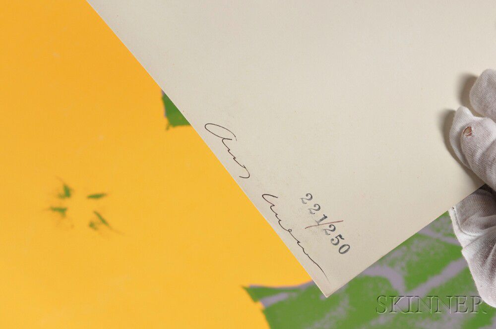
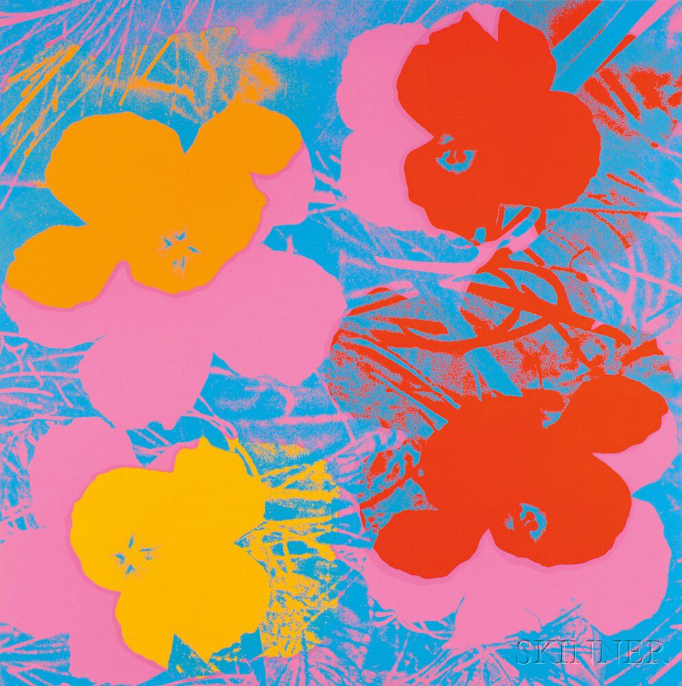
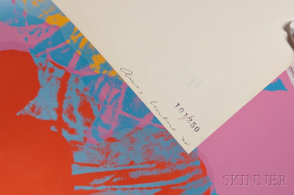
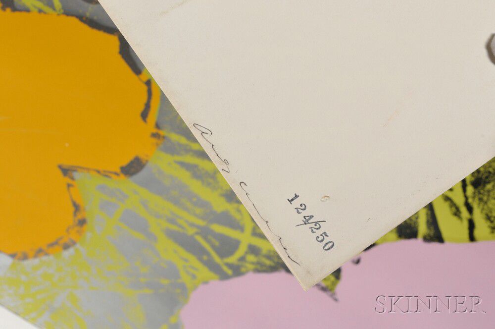
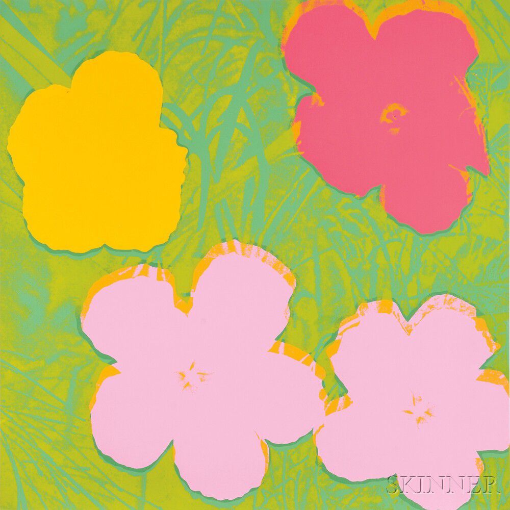
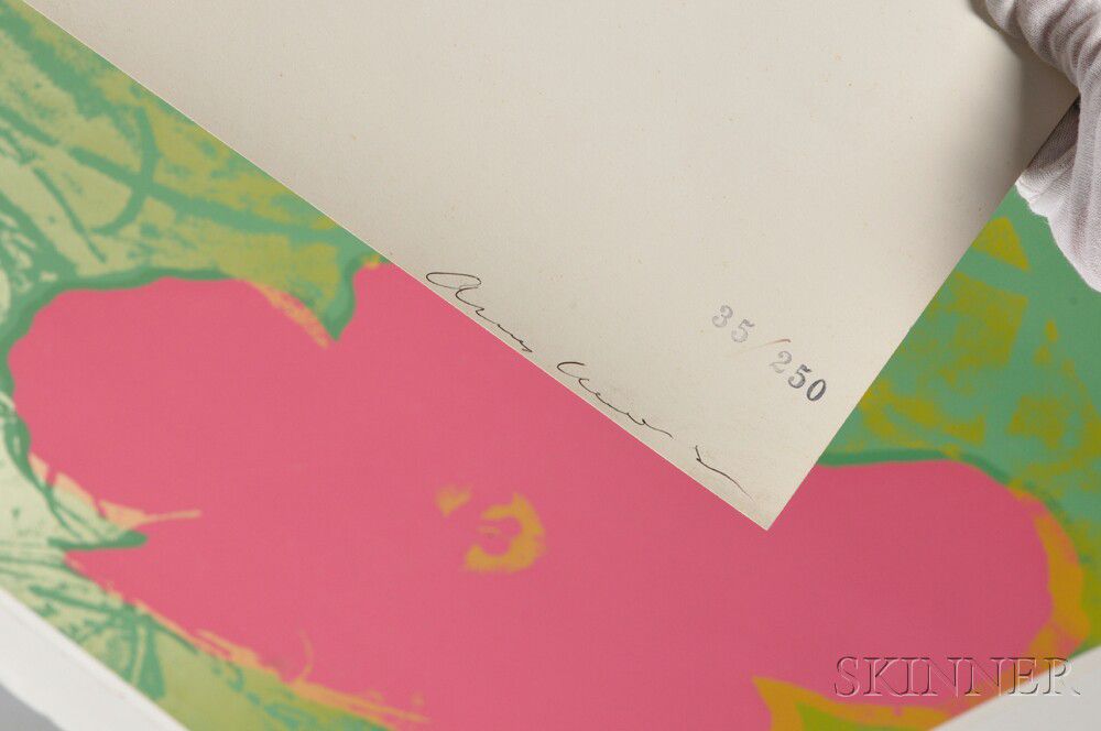
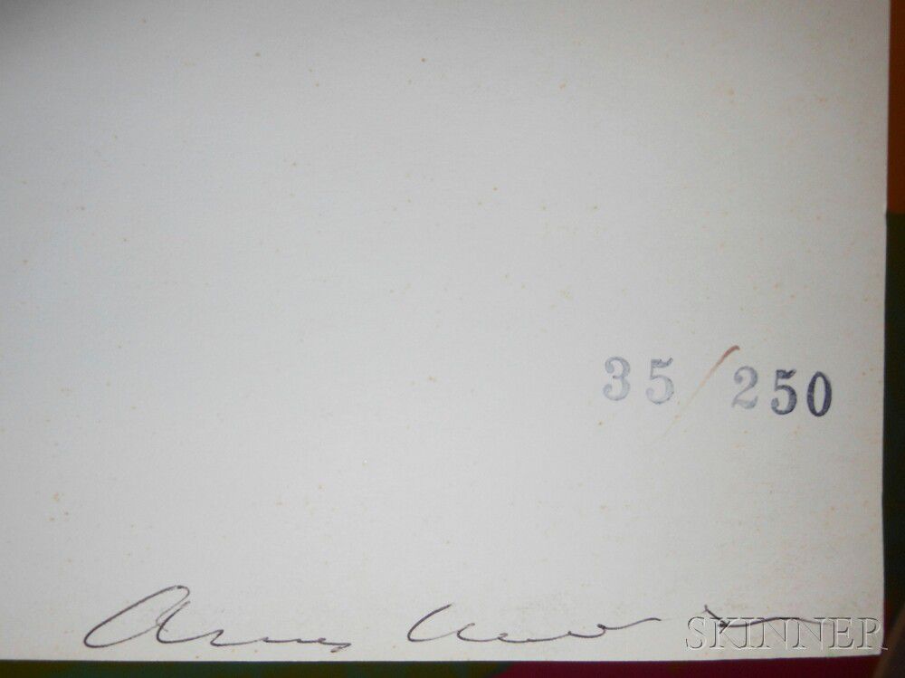
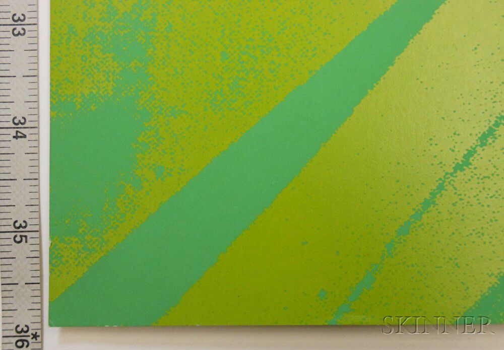
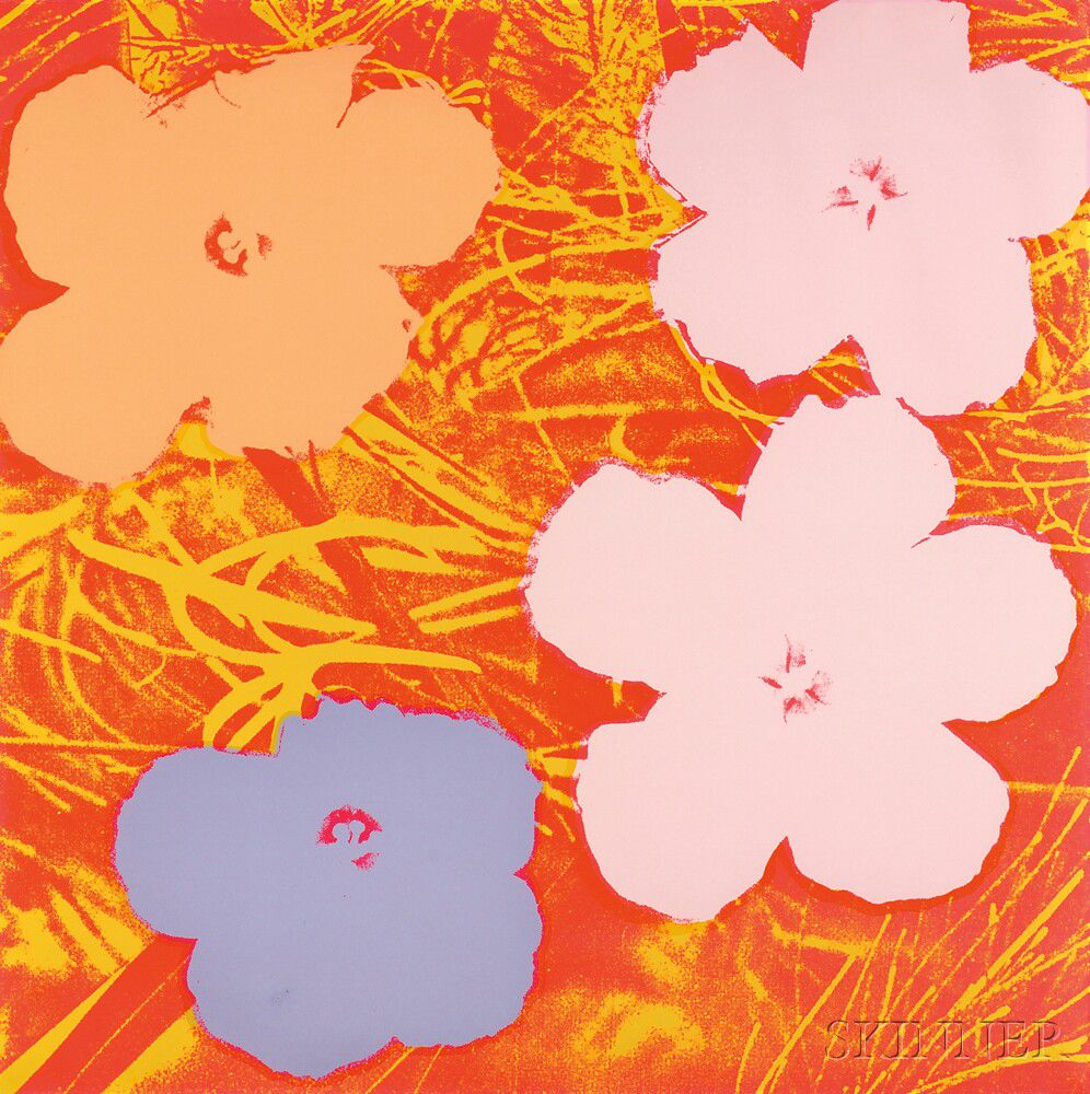
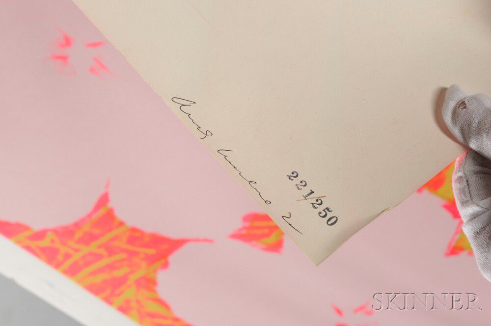
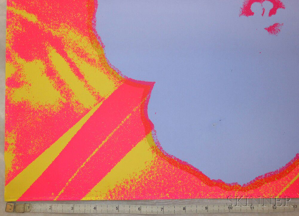
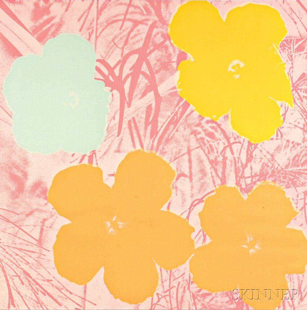
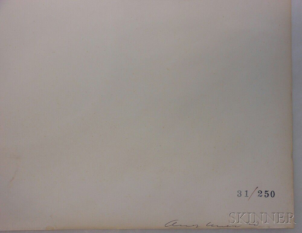
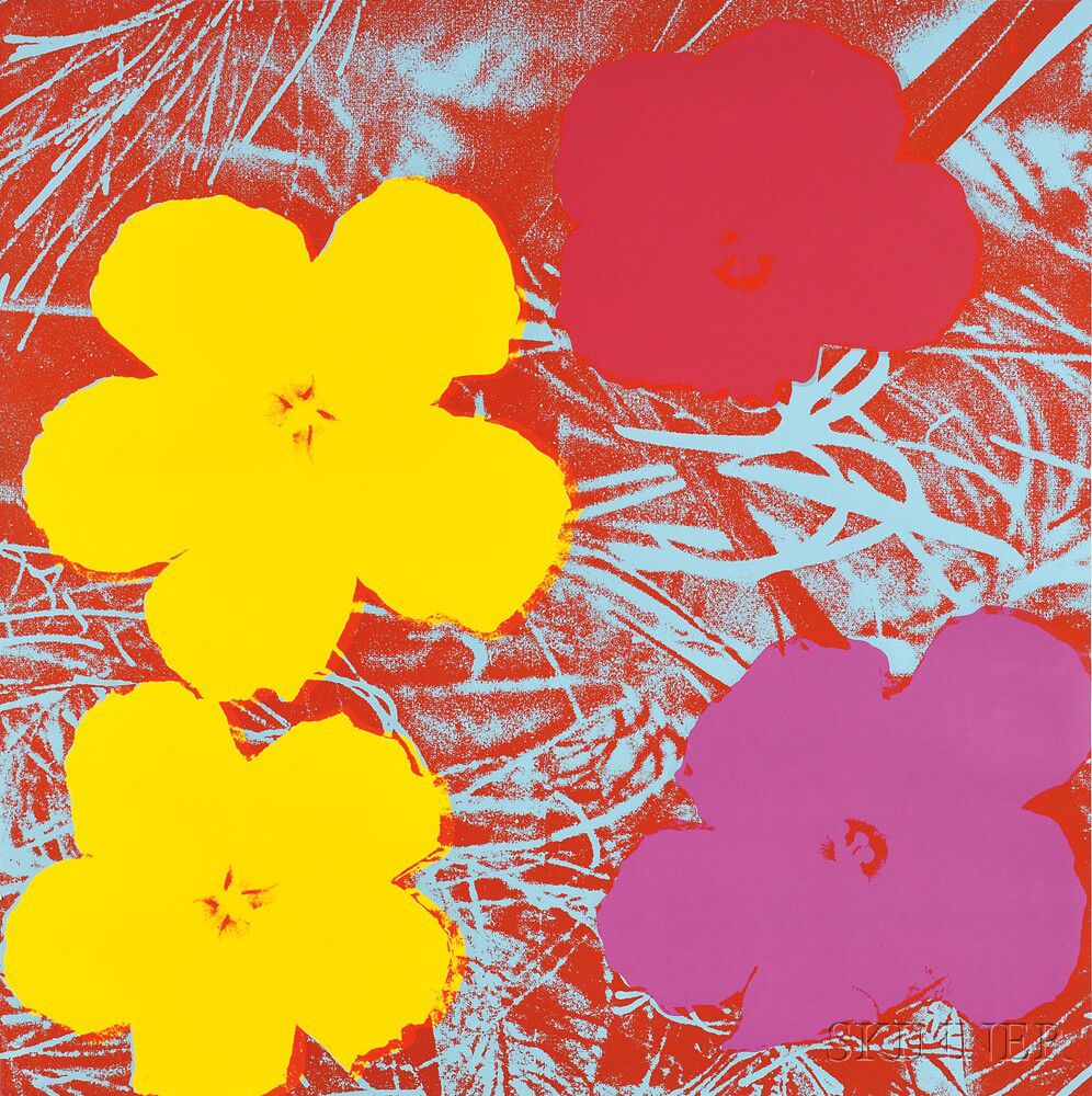
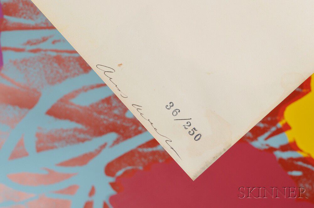
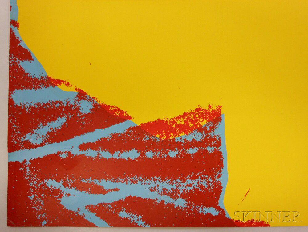
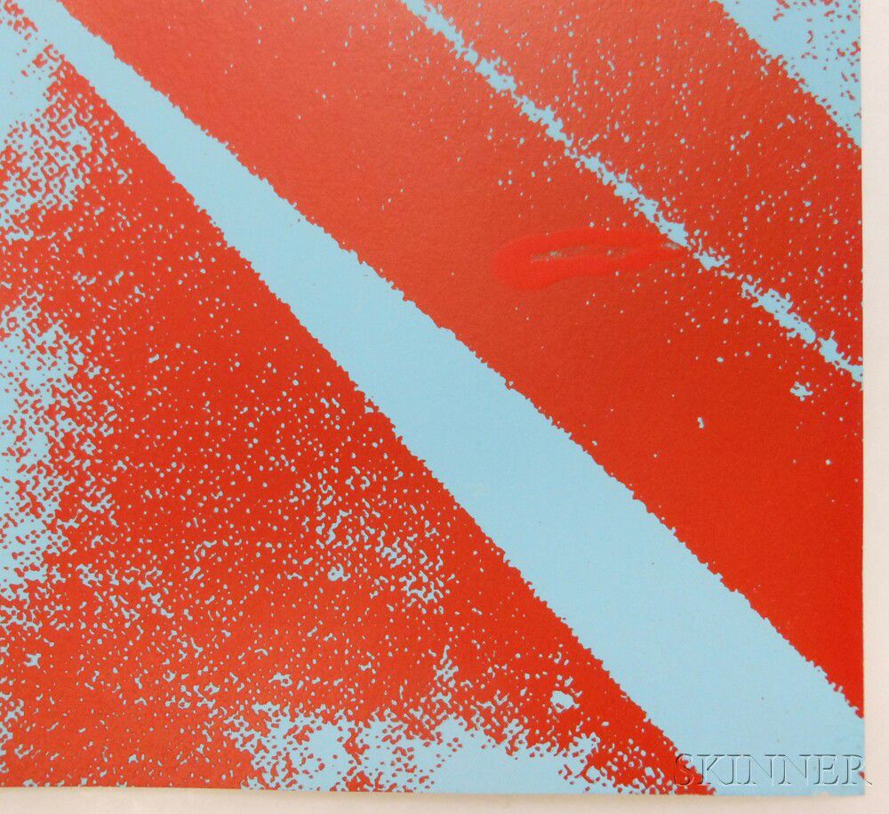
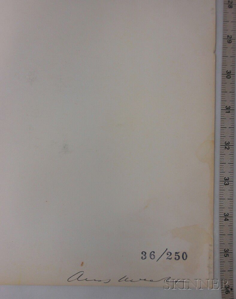
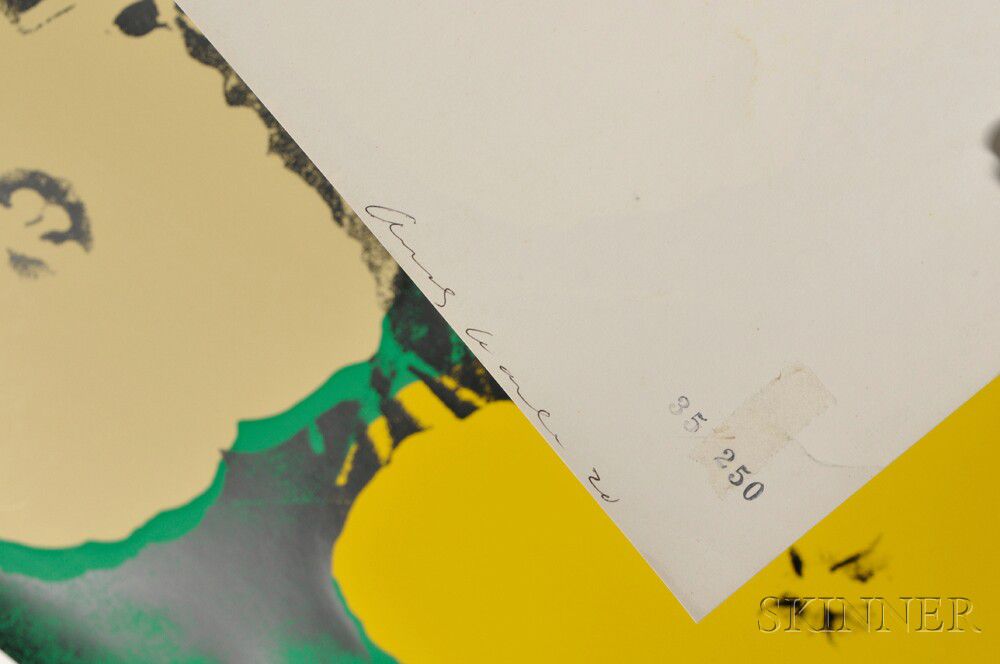
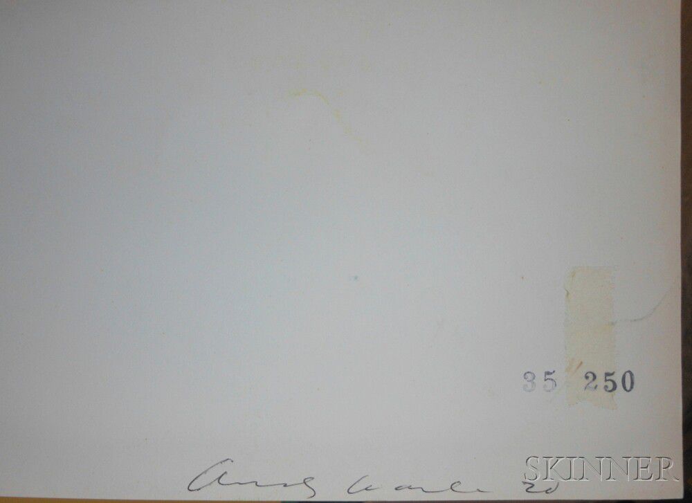
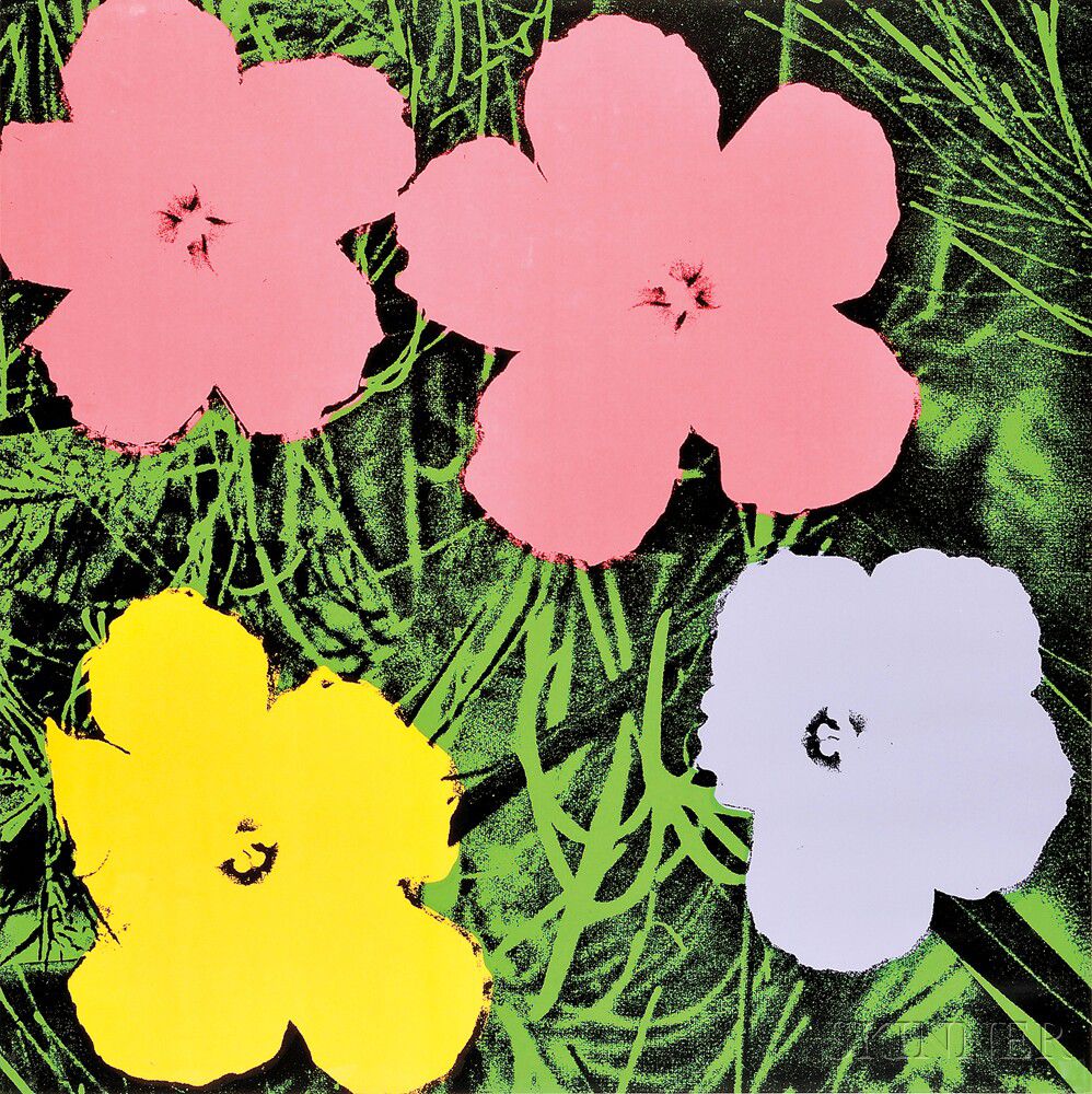
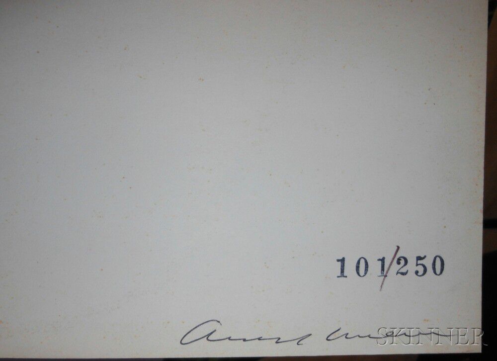
Flowers/A Portfolio of Ten Works, Suite of 10 screenprints 1970, edition of 250 plus proofs, printed by Aetna Silkscreen Productions, Inc., New York, published by Factory Additions, New York (Feldman & Schellmann, II.64-73). Each signed "Andy Warhol" on the reverse and numbered with stamp ".../250" on the reverse. Color screenprints on paper, sheet size 36 x 36 in. (91.4 x 91.4 cm),framed.
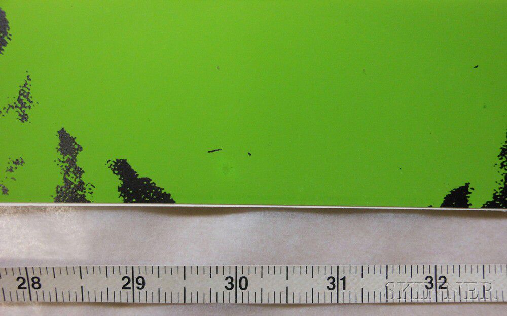
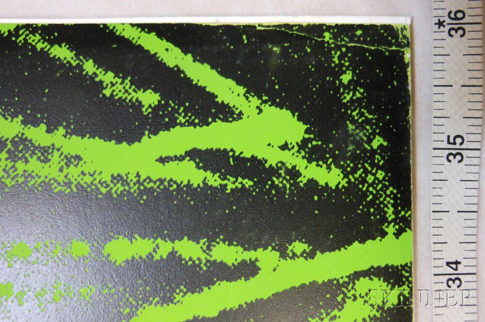
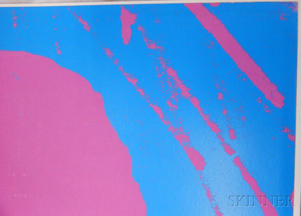
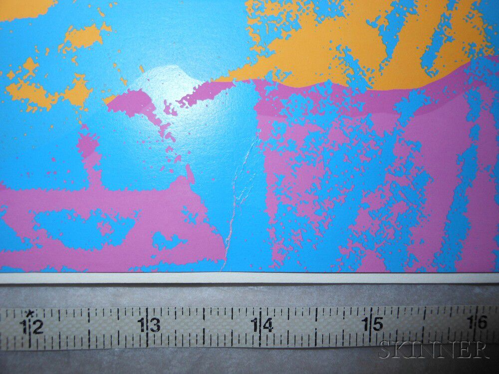
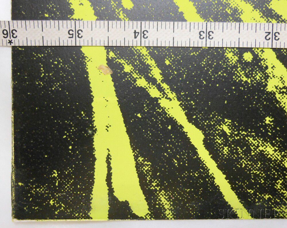
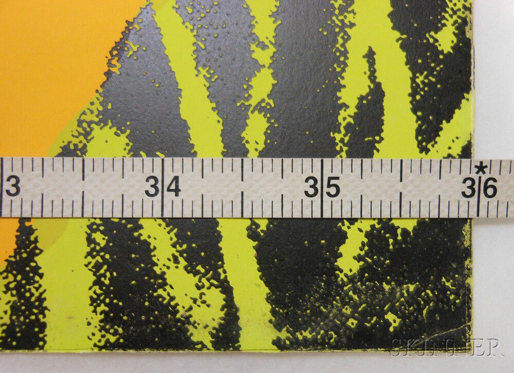
Condition: A married suite, some with minor wear at corners and/or edges, most with soiling to verso, many with very subtle handling creases.
Provenance: A private Massachusetts collection.
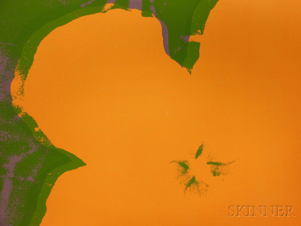
N.B. Warhol took creatively acquired the image for his Flowers paintings and prints from the magazine Modern Photography. It had been shot by Patricia Caulfield, the magazine's executive editor, and published in the June 1964 issue. Caulfield had used the image in a fold-out spread, where multiple versions of the image demonstrated how a new Kodak home color processing system could be used to manipulate color photographs.1
This presentation would have instantly appealed to Warhol who ultimately re-used the image with countless color configurations, just as Caulfield had done in the magazine. The original image was rectangular and depicted seven hibiscus blossoms. Warhol cropped and manipulated it into a square composition of four blooms, even cutting, pasting, and rotating one of the blooms to a new position closer to three of its companions.
The shift to a square composition allowed him to play with the composition's orientation. Warhol also varied the sizes and media of the composition, but always incorporated his screenprinting technique.
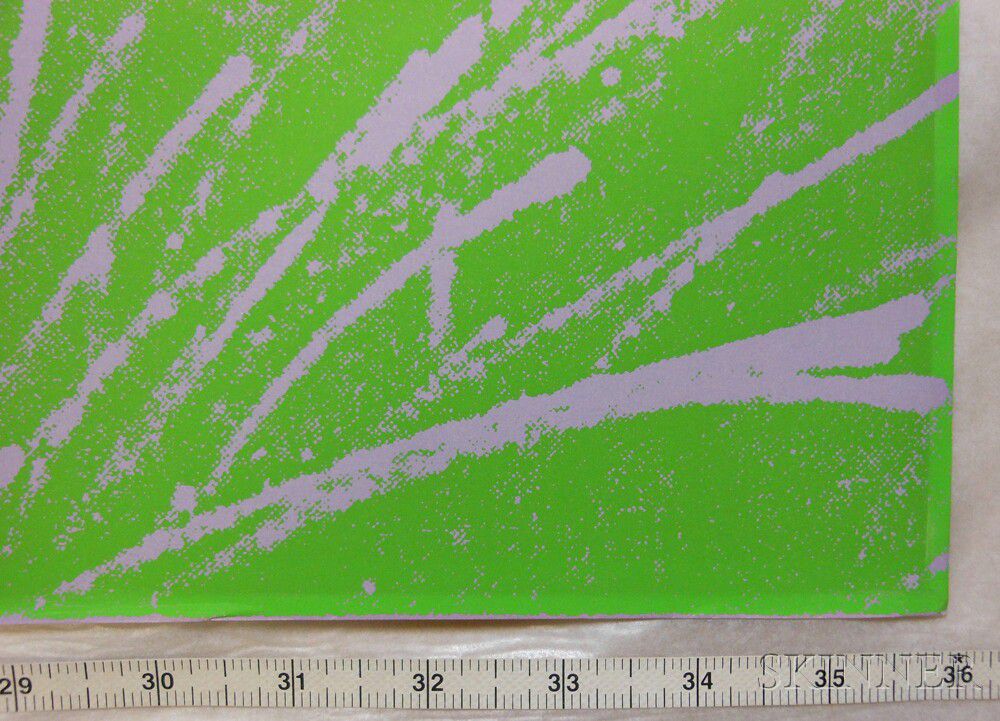
An important aspect of Warhol's manipulation of Caulfield's image was to dramatically increase the contrast of the image. The result removed all shadows and highlights from the blossoms and turned the leaves and grasses beneath them into a flat pattern. Warhol's first show at the prestigious Leo Castelli Gallery opened in late November of 1964, and focused on the first Flowers paintings. David Bourdon, an art critic for the The Village Voice, described Warhol's Flowers saying, "The flowers appear to float against a murky background of waving green grass. They are like cut-out gouaches by Matisse set adrift on Monet's lily pond."2
We cannot help but tie the Flowers to the long history of floral still lifes as Bourdon did. At the same time, Warhol's perspective is utterly new. While the subject matter came from nature, the colors did not. They are Day-Glo, fluorescent, and neon. They are manufactured. The flattened, unmodelled blossoms only heighten the sense of their fabrication. The juxtaposition of manufactured nature is conspicuously ironic. Warhol is "…showing us mechanical ways of seeing and feeling… [but this is] concealed in blandness. These glossy, floral-patterned paintings look like printed oilcloth, plastic tablecloths, or…wallpaper.3 Even the "original" paintings employ screenprinting, heightening the sense of mechanization and mass-production. The publication of the Flowers portfolio in 1970 only strengthened the aspect of fabrication, especially when all ten are hung together.
From a contextual perspective, the timing of the selection of the subject of flowers is interesting. It seems simplistic, and it is meant to. It comes just after his Disasters works of 1962-1963 and his ill-fated 1964 Thirteen Most Wanted Men to say nothing of the Marilyn and Jackie images - iconic figures of beauty associated with early and untimely deaths.4 This cannot help but connect the flowers to mortality and the funereal; to remind the viewer of the transient nature of flowers, youth, and life. This sense is completely undermined by the visual choices Warhol made. The colossal scale of these blooms seems anything but fragile and transient. Their high contrast makes the reproductive organs of stamen and pistil the only recognizable elements of these flowers.5 This reminds the viewer of the fecundity of flowers; not the funereal.
None of the associations conjured by Warhol's flowers are new or gut-wrenching, but his shift away from celebrity, consumerism, and death is striking. Regardless of what nuanced associations flowers may have to viewers, the subject is largely lacking in narrative or emotion. Michael Lobel makes the case for this being a purposeful shift in his In Transition: Warhol's Flowers essay of 2012. These flowers are not readily identifiable - even a botanist would have trouble identifying them as hibiscus - and they were certainly not selected because of their Pop icon status. Instead they become iconic because they are created by Warhol. Going forward, Warhol will be drawn to more obscure subjects that become famous when passed through his artistic machine.
1 Warhol used Caulfield's image without permission, and in 1966 Caulfield sued. The two settled out of court, and this changed one of the essentials of Warhol's process. Going forward his work was based on images he composed and shot himself. In his defense, Warhol didn't merely steal Caulfield's image. He radically manipulated it to create his own image.
2 http://www.interviewmagazine.com/art/andy-warhols-flower-power/
3 David Bourdon, "Art: Andy Warhol" in The Village Voice, December 3, 1964, page 11.
4 Ibid.
5 The series was commissioned for the New York World's Fair. Depicting actual criminal mug shots, the piece was censored and over-painted before the public could see it.
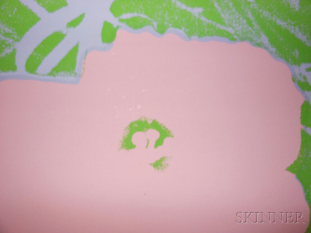
6 These elements were clearly important to Warhol, as he replaced the center of the blossom he had moved with the center of another flower to make them stand out more clearly.
Estimate $400,000-600,000
All have been removed from their frames. They are now hinged at the upper corners with linen hinges. Conditions are list by the catalogue raisonne numbers:
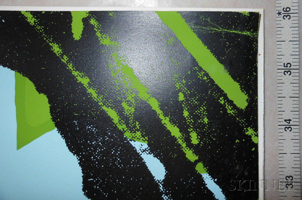
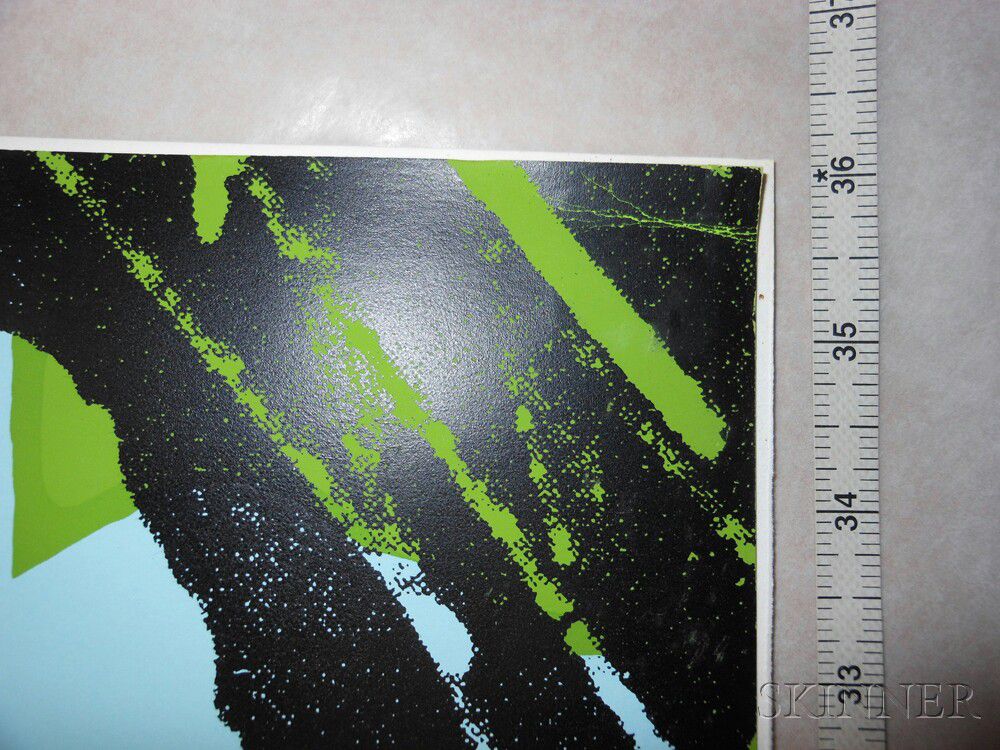
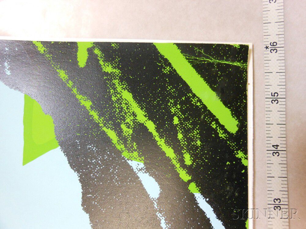
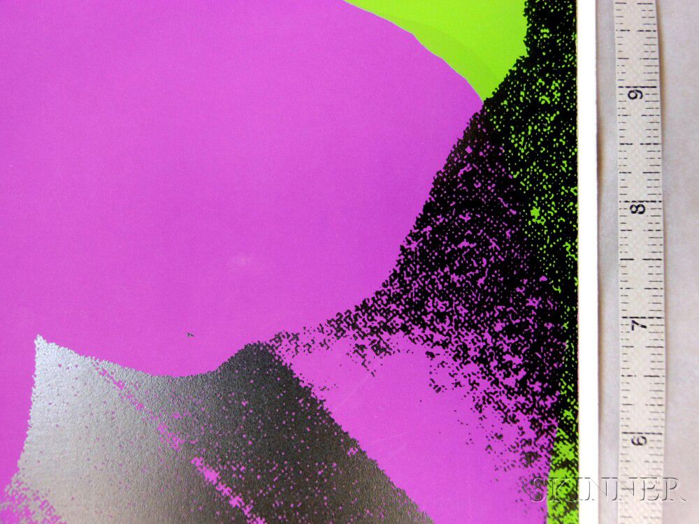
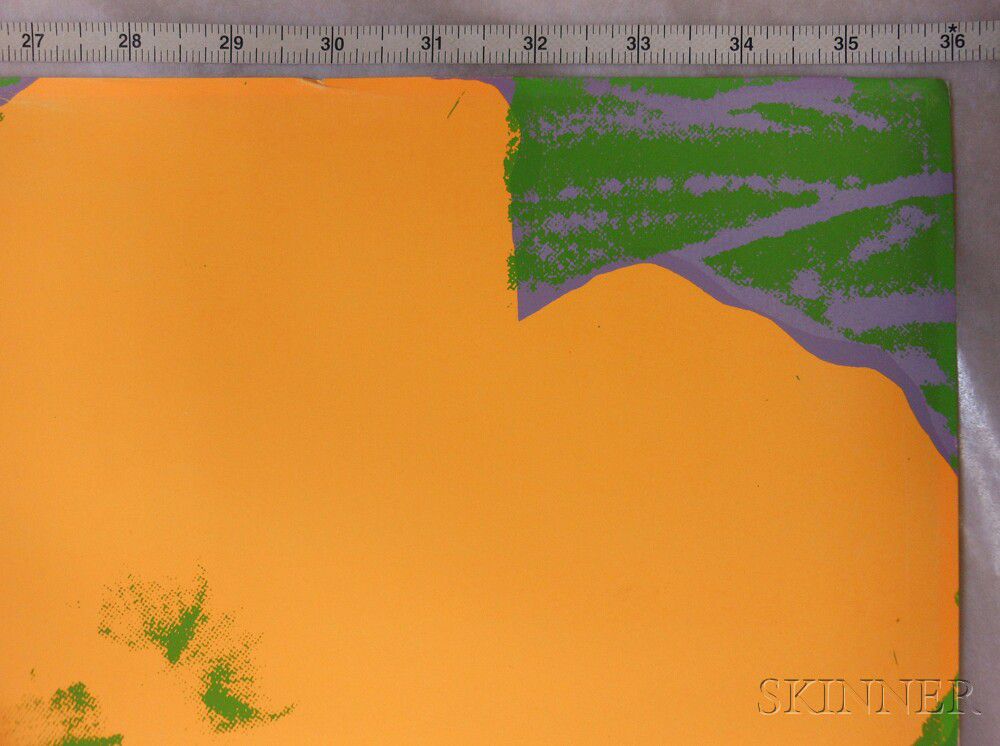
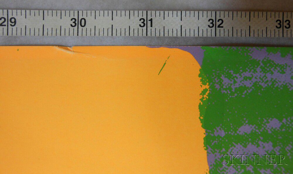
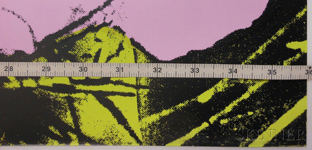
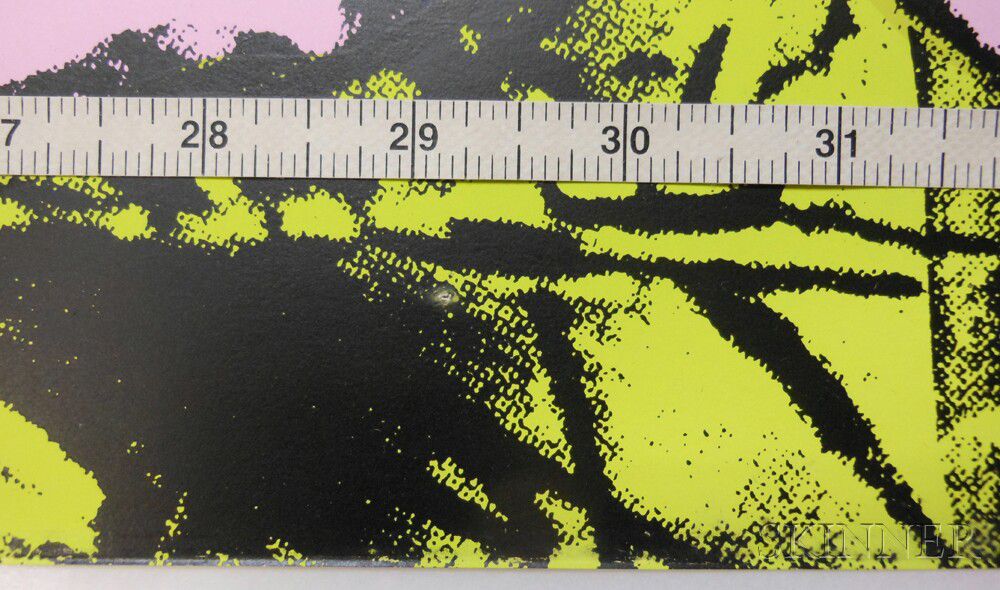
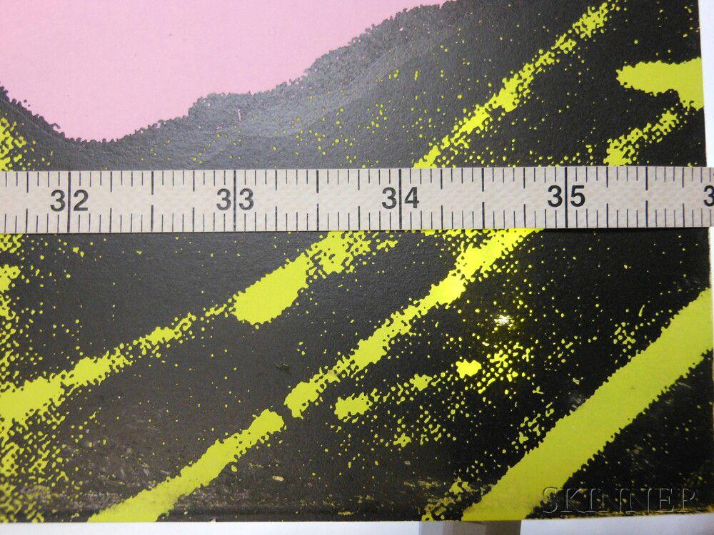
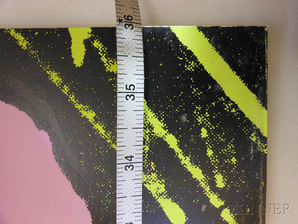
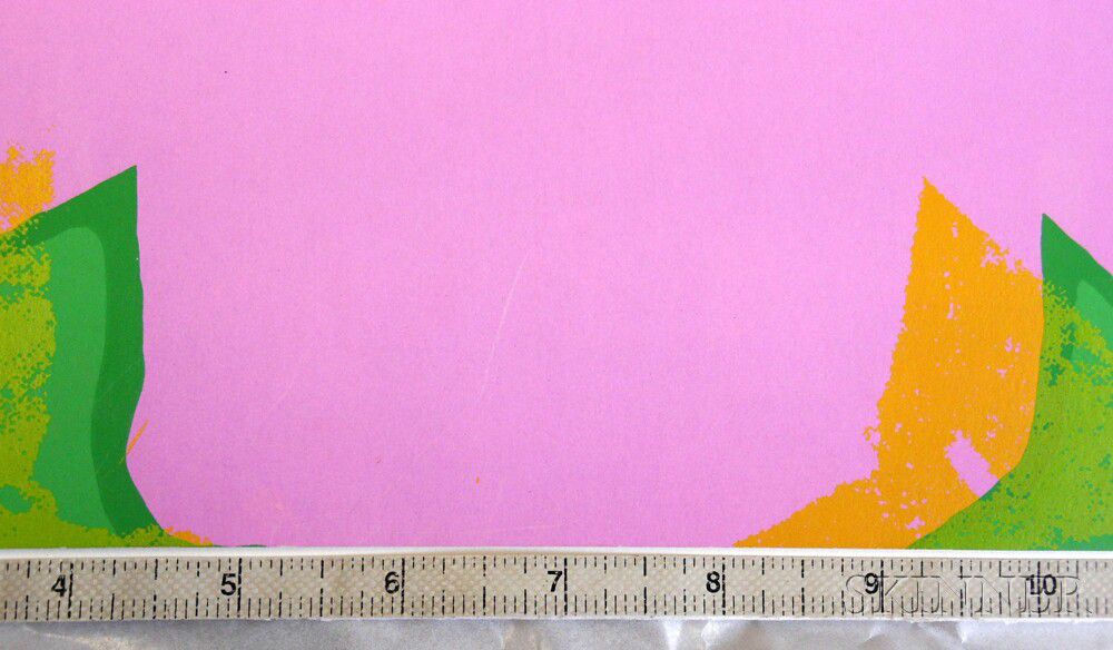
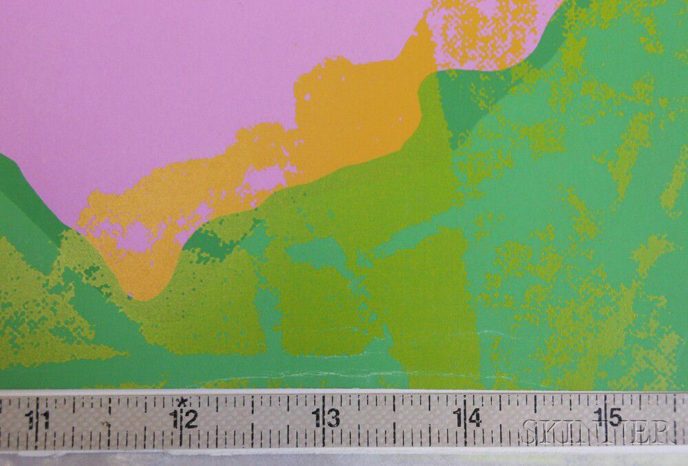
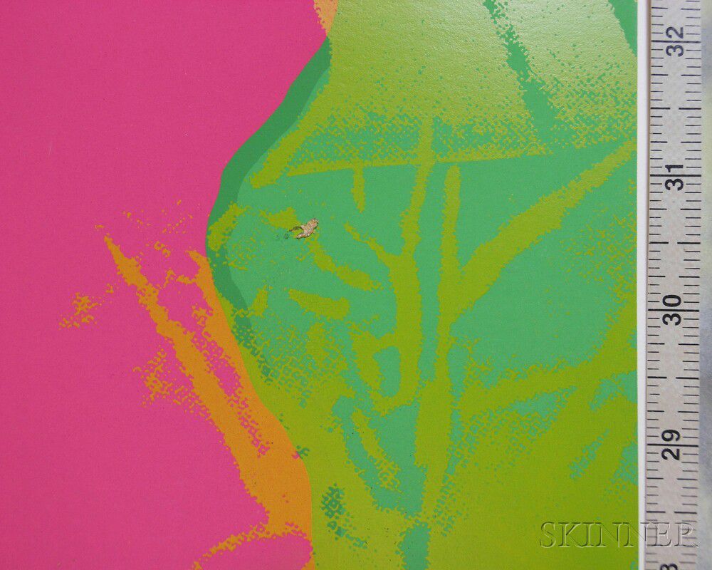
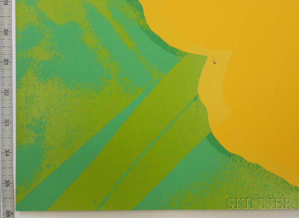
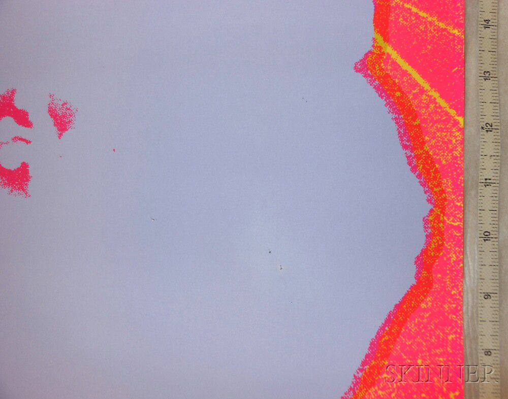
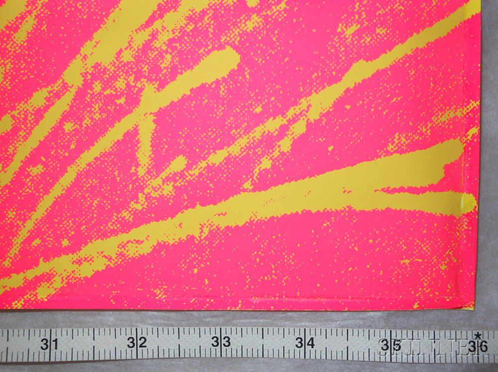
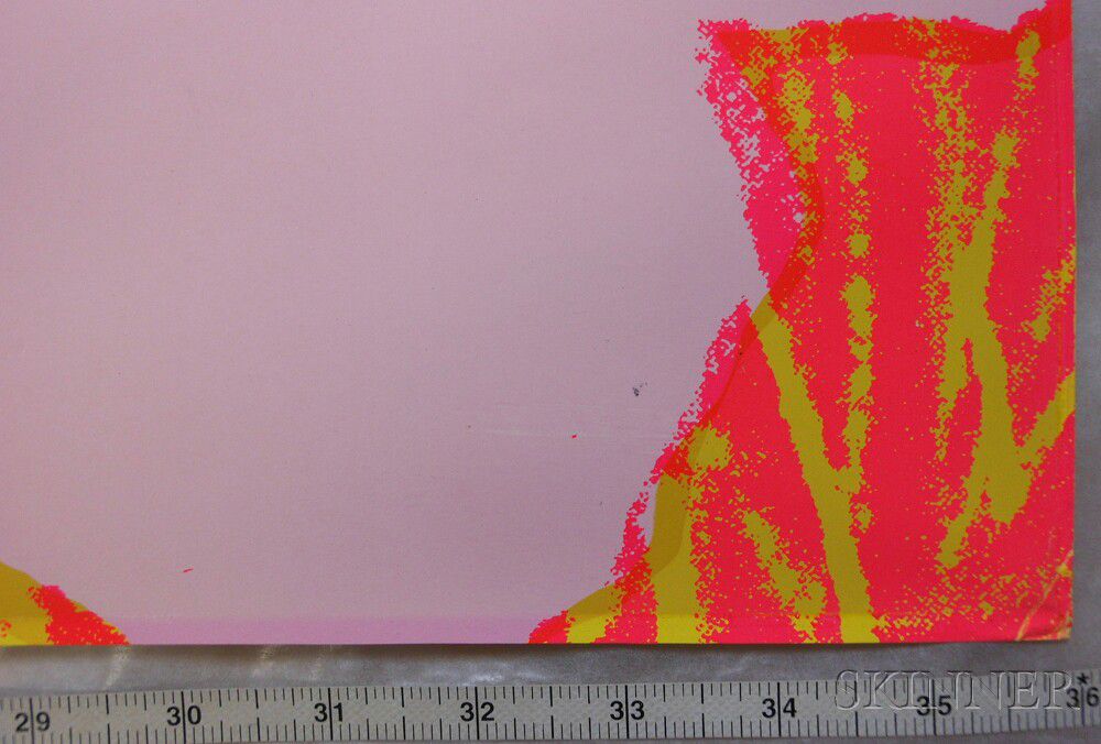
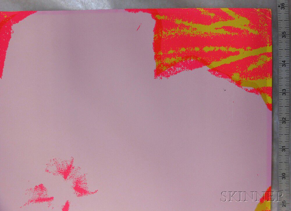
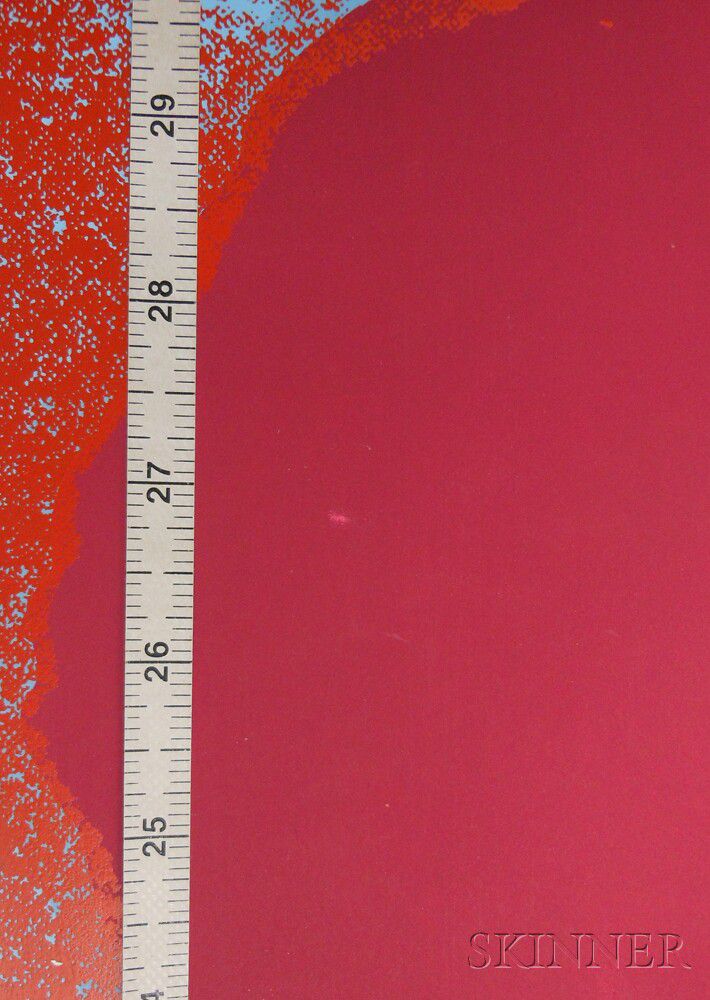
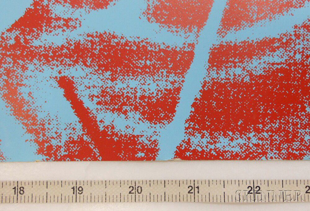
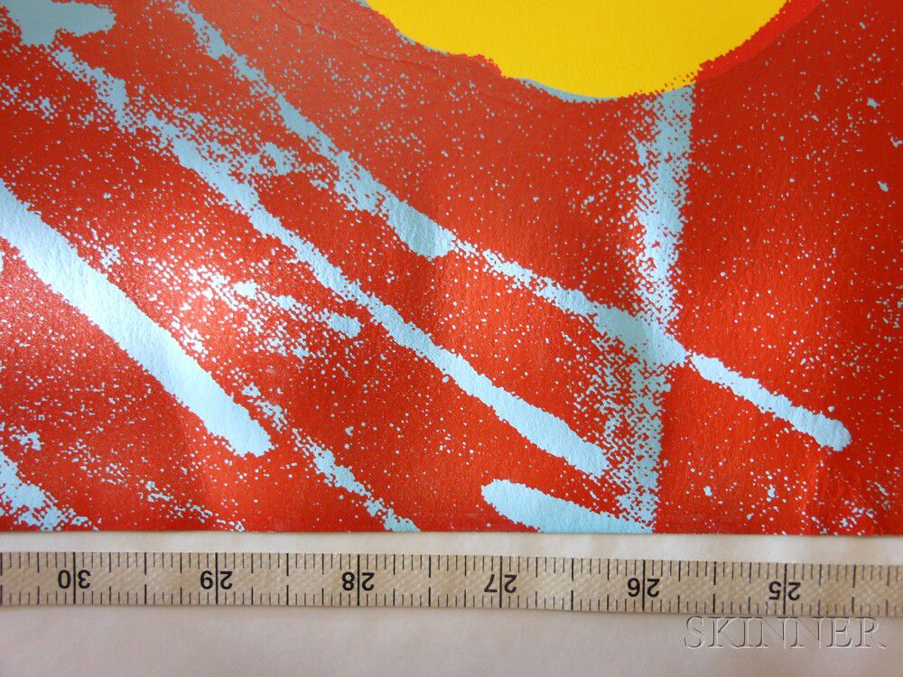
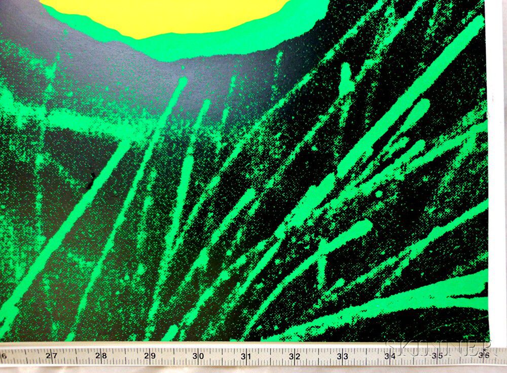
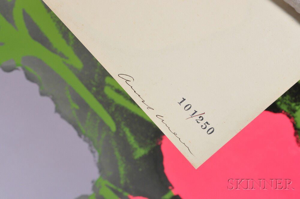
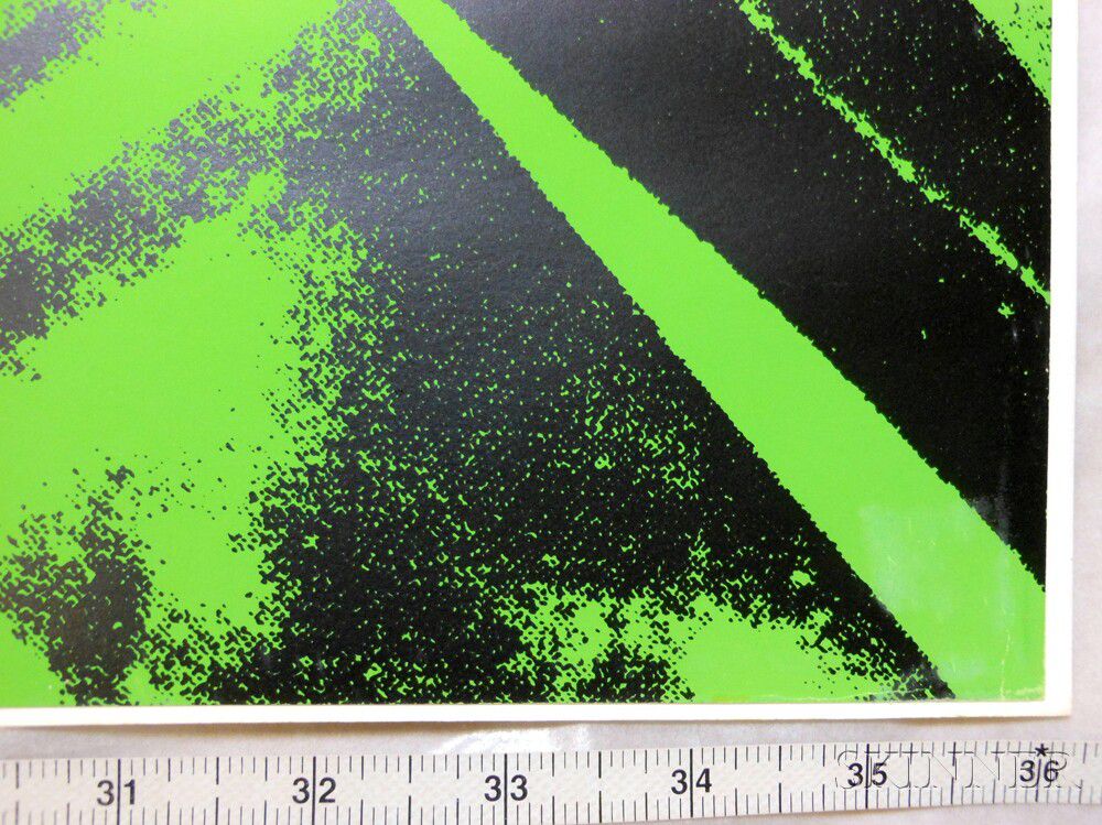
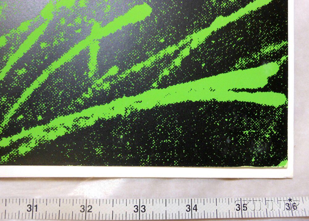
II64: Signed in ink and numbered 101/250. Hinged at upper corners with white cloth tape. Minor creases to corners at u.r. and l.r. (both affecting ink). Subtle water spot or similar (about 1/4 inch) to surface l.r.. Subtle rub u.l. Minor soiling to verso, primarily near edges.
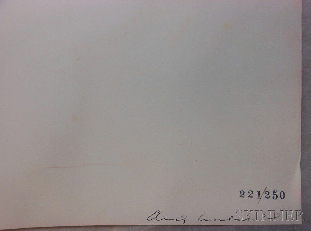
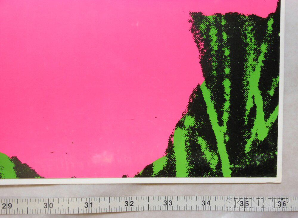
II65: Signed in ink and numbered 221/250. Subtle shift to color. Subtle surface rubs (mostly to mauve flower) visible only at certain angles. Minute nick to both the upper and lower edge.
II66: Signed in ink and numbered 101/250. Hinged at upper corners with white cloth tape. Crease affecting the ink (about 1 inch long) to center of lower edge.
II67: Signed in ink and numbered 124/250. Minor wear to corners. Surface accretion near corner l.l. subtle rub to surface along right edge (probably from frame). Minute indentations into paper along sides about 1 1/2 inches from the edges on verso. Only 2 of these affect the image: both as pin holes near the upper right corner (next to the lavender flower). Minor accretion (about 1/8 inch) l.r.
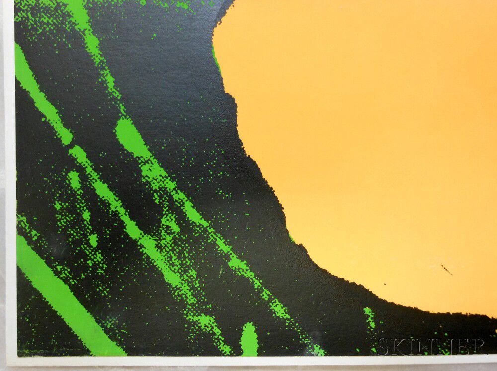
II68: Signed in ink and numbered 35/250. Hinged about 3 inches below the upper edge Subtle rub within pink flower (l.l.) visible only from an angle.
II69: Signed in ink and numbered 221/250. Very subtle fading. Wear to corners (more so to right corners),Minor soiling or accretions to purple flower, indentation running parallel to and along all edges about 1/4 inch in from edge (probably from previous framing). Minor crease and ding to edge l.l.
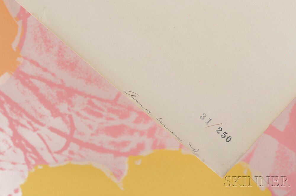
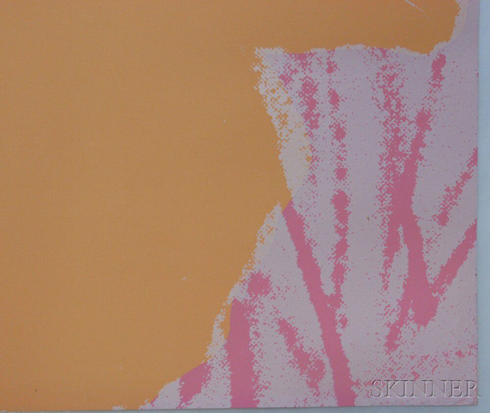
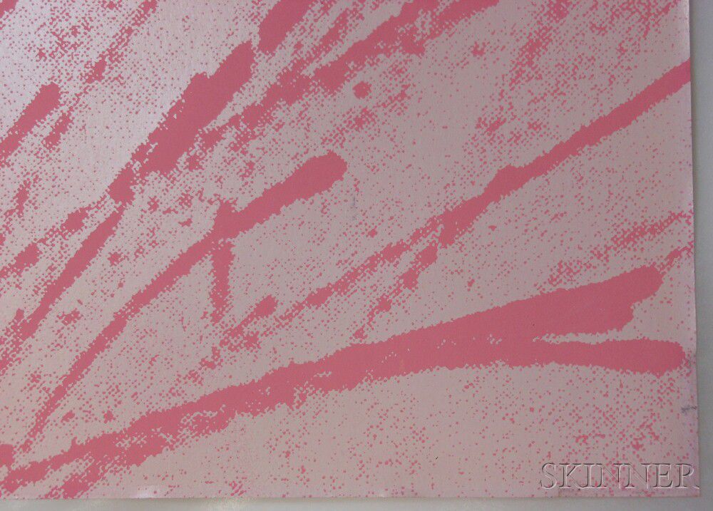
II70: Signed in ink and numbered 31/250, very minor wear to tip of 1 corner, more general wear and soft creases to all corners. Subtle rippling and unpressed handling creases. Subtle staining at edges on verso. Possible minor water stain to corner u.l. (visible only on verso).
II71: Signed in ink and numbered 36/250. Subtle surface rub to maroon flower. Minor water staining to corner l.l., visible primarily on the reverse, but subtly affecting the sheen on the surface. Minute wear to right edge. Toning and ghost image to verso plus minor soiling. Handling crease near edges - primarily the left edge. Gently press only at the very edge.
II72: Signed in ink and numbered 35/250. Hinged at upper center. Old hinges and tape to verso at edges, some with very minor skinning. Crease to corner u.r. affecting ink.
II73: Signed in ink and numbered 101/250. Hinged near corners along right side, verso. Rubs to surface just visible at hinges. Rub (about 1/2 inch) to upper pink flower.
The absence of a condition statement does not imply that the lot is in perfect condition or completely free from wear and tear, imperfections or the effects of aging. Condition requests can be obtained via email (lot inquiry button) or by telephone to the appropriate gallery location (Boston/617.350.5400 or Marlborough/508.970.3000). Any condition statement given, as a courtesy to a client, is only an opinion and should not be treated as a statement of fact. Skinner Inc. shall have no responsibility for any error or omission.
Keywords
David Bourdon, Patricia Caulfield
Robin S.R. Starr
Vice President
Director of American & European Works of Art
508-970-3206

Elizabeth Haff
Specialist, American & European Works of Art
Old Masters & 19th Century
508-970-3206

Kathleen M. Leland
Specialist, American & European Works of Art
Modern & Contemporary Art
508-970-3206

James Leighton
Specialist, American & European Works of Art
Fine Photographs
508-970-3206
American & European Works of Art
The American & European Works of Art department brings years of experience, connoisseurship, and knowledge of art history to bear in every fine art appraisal, evaluation, and auction.
Lots in this sale
/758/1106758.jpg)
/627/1102627.jpg)
/163/1106163.jpg)
/164/1106164.jpg)
/682/1097682.jpg)
/118/1049118.jpg)
/579/1099579.jpg)
/411/1105411.jpg)